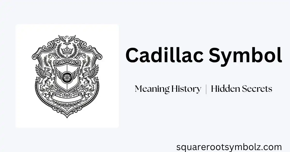
The Cadillac symbol is one of the most recognizable emblems in the automotive world. Representing luxury, innovation, and prestige, the iconic crest has evolved alongside the brand for more than 120 years. While its appearance has changed more than a dozen times since Cadillac was founded in 1902, the symbol has always reflected the company’s commitment to premium craftsmanship and timeless design.
Today, the Cadillac symbol appears on some of the world’s most luxurious vehicles, including the Escalade, CT5, LYRIQ, and CELESTIQ. Whether you’re a car enthusiast or simply curious about automotive branding, understanding the history and meaning behind the Cadillac symbol offers fascinating insight into one of America’s most iconic luxury automakers.
What Is the Cadillac Symbol?
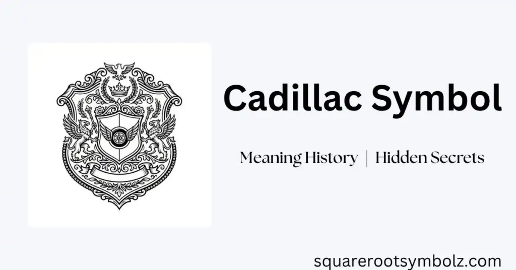
The Cadillac symbol is the official emblem of Cadillac, the luxury vehicle division of General Motors. It’s based on a historic coat of arms associated with Antoine de la Mothe Cadillac, the French explorer credited with founding Detroit in 1701.
Over the decades, the emblem has transformed from a detailed heraldic design into today’s sleek, geometric crest logo, reflecting Cadillac’s evolution while preserving its heritage.
Key Facts
| Feature | Details |
| Founded | 1902 |
| Parent Company | General Motors |
| Symbol Type | Heraldic crest |
| Inspiration | Antoine de la Mothe Cadillac’s coat of arms |
| Crown & birds removed | 1999–2000 redesign |
| Laurel wreath removed | 2014 redesign |
| Current design | Black-and-white digital crest, phased in 2020s |
The Origin of the Cadillac Symbol
Cadillac adopted its emblem shortly after the company was established in 1902. The founders wanted a symbol that communicated sophistication, nobility, and excellence qualities that aligned with the luxury automobiles they intended to build.
The design drew from the heraldic crest linked to Antoine de la Mothe Cadillac, who founded Detroit and was said to descend from French nobility. Historians debate the precise accuracy of the original family arms, but the emblem became a defining part of Cadillac’s identity from the brand’s earliest days.
What Does the Cadillac Symbol Mean?
The Cadillac crest combines several traditional heraldic elements, each carrying its own symbolism.
The Shield
The shield forms the foundation of the design and represents strength, protection, and determination values Cadillac has tied to engineering excellence and durability.
The Crown
Early versions of the logo (1905–1999) featured a crown above the crest, symbolizing nobility, leadership, and premium status. It was retired in the 1999–2000 redesign, well before the more widely known 2014 refresh.
The Merlettes
The small birds on the crest are heraldic merlettes a traditional symbol representing honor and noble heritage, based on martlets (birds depicted without feet or beak in classical heraldry). Like the crown, the merlettes were dropped in the 1999–2000 redesign, not in 2014 as some sources incorrectly state.
The Colors
The crest traditionally combines red, black, blue, gold, and white colors historically tied to courage, wisdom, purity, and prosperity in heraldic tradition. Modern versions simplify the palette but keep the black-and-gold contrast that’s become synonymous with the brand.
The Laurel Wreath
From 1963 to 2014, a laurel wreath encircled the crest the longest-running version of the logo in Cadillac’s history. It symbolized victory and excellence. Cadillac retired the wreath in 2014 to create a cleaner, more modern design better suited to digital use.
Cadillac Symbol Evolution: The Real Timeline
Cadillac’s emblem has changed more often and more specifically than most casual histories suggest. Here’s the corrected sequence:
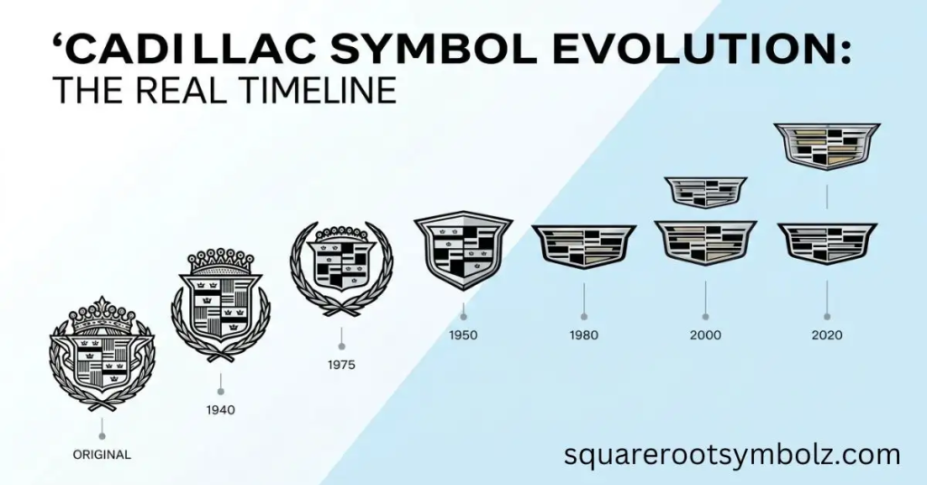
| Year | Change | Key Details |
| 1905 | Original emblem | Ornate crest, crown, birds, and detailed heraldic border |
| 1915 | Wings added | First winged variant introduced |
| 1933 | Triangular shape | Crest set inside a stretched, wing-flanked design |
| 1957 | V-shaped badge | Crown and coat of arms redesigned; birds harder to distinguish |
| 1963 | Wreath introduced | Colorful crest wrapped in a silver laurel wreath used for over 40 years |
| 1999–2000 | Crown & birds removed | Crest simplified into a sleeker, more geometric shield; wreath retained |
| 2014 | Wreath removed | Shield elongated and stood alone with a cursive “Cadillac” wordmark beneath it |
| 2020s | Monochromatic refresh | Black-and-white digital crest rolled out across web and social; illuminated badge debuted on the LYRIQ |
This means the 2014 update often cited as “the” big Cadillac logo change was actually the second major simplification. The crown and birds had already disappeared 15 years earlier.
Why Has the Cadillac Symbol Changed So Often?
Branding Strategy
As Cadillac expanded into global and younger luxury markets, the company repeatedly modernized its branding to stay relevant against European luxury competitors.
Design Trends
Automotive logos across the industry have trended toward flatter, simpler marks. Cadillac followed this pattern in both 1999–2000 and 2014 while preserving the core shield shape.
Digital and EV-Era Compatibility
Modern branding has to work across websites, mobile apps, infotainment displays, and illuminated EV badges. The simplified, monochromatic crest scales far better across these surfaces than the original detailed heraldic design ever could which is why Cadillac introduced an illuminated version specifically for its LYRIQ electric SUV.
Old Cadillac Symbol vs. New Cadillac Symbol
| Feature | Classic Symbol (pre-1999) | Modern Symbol (2014–present) |
| Crown | Yes | No |
| Birds (merlettes) | Yes | No |
| Wreath | Yes | No |
| Design style | Detailed, three-dimensional | Flat, minimalist |
| Focus | Heritage and heraldry | Contemporary luxury |
| Digital/EV use | Limited | Built for digital and illuminated badges |
The Heraldic Blazon, Explained
For those interested in the source material: Cadillac’s crest structure follows real heraldic conventions. The shield is divided into quarters, a layout called “quartering” in heraldry, traditionally used to combine multiple family lines or achievements into a single coat of arms. The alternating bands and merlettes are consistent with French heraldic design from the era Antoine de la Mothe Cadillac would have lived in part of why the emblem has always read as aristocratic rather than purely decorative.
Final Thoughts
The Cadillac symbol is far more than a decorative badge it’s a visual record of more than 120 years of luxury, craftsmanship, and reinvention. From its origins in a French heraldic crest to today’s minimalist, illuminated digital badge, the emblem has changed more times, and more specifically, than most retellings suggest. As Cadillac continues its shift toward electric vehicles, its crest keeps evolving right along with it a rare example of a century-old symbol still being actively redesigned for a modern era.
FAQs
What does the Cadillac symbol represent?
It represents luxury, heritage, and innovation, tracing back to the coat of arms associated with Antoine de la Mothe Cadillac, the founder of Detroit.
When were the crown and birds removed from the Cadillac logo?
The crown and birds (merlettes) were removed in the 1999–2000 redesign 15 years before the more commonly cited 2014 update.
Why did Cadillac remove the wreath?
The wreath was removed in 2014 to create a cleaner, more modern emblem better suited to digital branding and a wider vehicle fascia.
Who inspired the Cadillac symbol?
The design is based on the heraldic crest associated with Antoine de la Mothe Cadillac, the French explorer who founded Detroit in 1701.
Is the Cadillac logo changing again?
Yes. In the 2020s, Cadillac introduced a black-and-white version of the crest for digital use and debuted a monochromatic illuminated badge on the LYRIQ, its first dedicated EV.
Has the Cadillac symbol always been a crest?
Yes. While its details have changed more than a dozen times since 1902, the shield-based coat of arms has remained the central element throughout.

I’m the creator of SquareRootSymbolz.com, where I publish easy-to-understand guides on symbols, Unicode characters, Alt codes, keyboard shortcuts, and copy-and-paste text symbols. My goal is to provide accurate, well-researched, and user-friendly content that helps readers quickly find the information they need.